

Phone menu (Mobile menu)
Also called: hamburger menu, mobile navigation, off-canvas menu, slide-out menu, phone menu, burger icon, responsive menu, mobile logo.
Not to be confused with the Side menu (Left panel). The side menu shows only on screens 1024 pixels or wider. Phones and smaller tablets use this phone menu instead. Icons on individual menu items are a separate setting: Add icons to menu items.
What this does
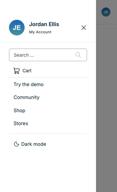
Section titled “What this does”On phones and tablets, the header shrinks to a logo, some icons and a menu button (the “hamburger”). Tapping the button slides out your menu. This section controls that phone header, apart from the desktop header in Header style (Header layout).
-
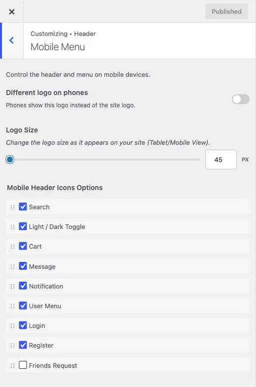
Go to Appearance > Customize > Header > Mobile Menu.
-
Optional: turn on Different logo on phones, then upload a Mobile Logo. By default phones use your desktop logo, scaled down. A separate logo helps when your desktop logo is a wide shape that is hard to read when small.
-
Set Logo Size. This is the tallest the logo can be on phones and tablets. It is separate from the desktop logo size.
-
Under Mobile Header Icons Options, drag the icons into the order you want. Untick any you do not want.
-
Click Publish.
-
Check the result on a real phone width, not only a narrowed desktop window.
You’ll know it worked when
Section titled “You’ll know it worked when”On a phone, the header shows your phone logo and icons in your order. Tapping the menu button slides out your menu.

Good to know
Section titled “Good to know”Which icons can I use?
Section titled “Which icons can I use?”- Search and User Menu / Login / Register are always there.
- Cart appears with WooCommerce or Easy Digital Downloads.
- Message, Notification and Friends Request appear with a community plugin. Friends Request is BuddyPress only.
- The Light / Dark Toggle can be dragged into this list too.
This list is separate from the desktop icon order. Set both if you want the same order on every device.
How do I fix the logo overlapping the icons?
Section titled “How do I fix the logo overlapping the icons?”A long icon list can crowd the logo. Remove some icons or lower Logo Size.
How do I change the phone menu width or the layout?
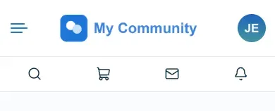
Section titled “How do I change the phone menu width or the layout?”Since 8.1.0 every phone header uses Layout Two: the icons sit in one row with the logo. The slide-out menu is full width on phones and tablets. The Mobile Header Layout and Mobile Menu Width controls no longer show for new sites. A site that saved Layout One or Layout Three, or a narrower width, keeps it. Layout Three is not offered when BuddyNext is active.
How do I show the user menu on mobile?
Section titled “How do I show the user menu on mobile?”Keep User Menu / Login / Register ticked in Mobile Header Icons Options.
Can keyboard and screen reader users open it?
Section titled “Can keyboard and screen reader users open it?”Yes. Focus moves into the menu when it opens and stays inside. Escape closes it, and focus goes back to the menu button.