

Color palette
Color palette
Section titled “Color palette”Customize > Color Options > Color Palette
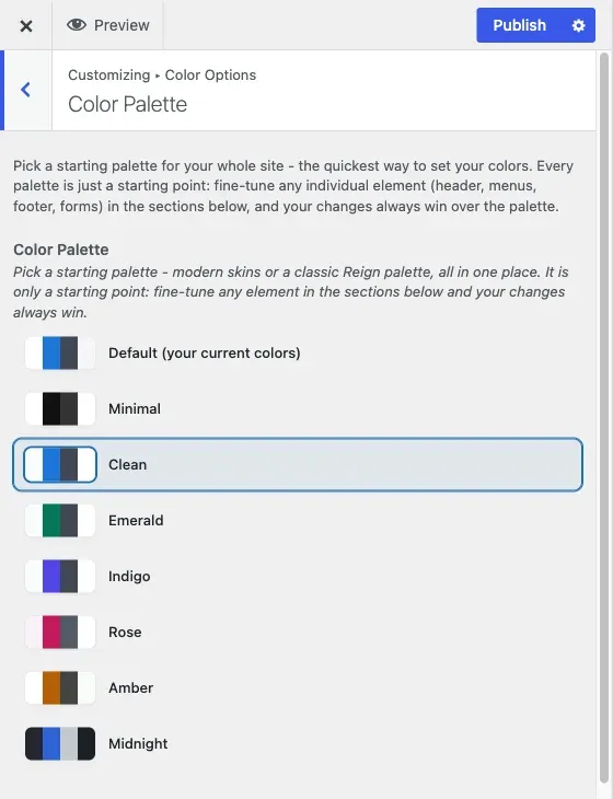
This is the recommended starting point for color on any Reign site. It holds a single radio picker with a swatch preview next to each option, and choosing one sets your header, menus, content, footer and forms - in both light and dark mode - in one move.
Color Palette and Site Skin
Section titled “Color Palette and Site Skin”Inside this section you may see the picker named in two ways. The picker you use is labelled Color Palette. Behind it sits a second control labelled Site Skin, which the Customizer normally hides because the Color Palette picker drives it for you. If you see “Site Skin” mentioned in a description (for example at the top of Individual Colors), it means this same palette choice. You never need to set both.
The choices
Section titled “The choices”- Default (your current colors)
- Minimal
- Clean
- Emerald
- Indigo
- Rose
- Amber
- Midnight
Each option previews its background, accent, text and surface colors before you click it, so you can compare them side by side rather than guessing from a name.
What picking a palette actually does
Section titled “What picking a palette actually does”Behind the one picker you see, Reign is setting a single theme value that the rest of the color system reads. Every element in Individual Colors and every element in Dark Mode Colors has a default that comes from whichever palette is active. Pick “Emerald” and both the light and dark versions of your header, menus, buttons and footer move to the emerald set without you touching anything else.
“Default” is not a neutral, colorless option - it keeps whatever colors your site is already using, which is either Reign’s original palette or whatever you last customized by hand. Choosing it is safe on an existing site because it does not reset anything.
Why this should be your only colour decision, most of the time
Section titled “Why this should be your only colour decision, most of the time”Reign also ships hundreds of individual color controls for people who need them - a header background that must match a client’s exact brand hex, a button that needs to stand out from the rest of the palette. Those live in Individual Colors and Dark Mode Colors, and anything you set there always overrides the palette at that one spot. That is the correct order to work in: palette first, because it is one decision instead of dozens, and then only open the per-element sections for the handful of things that genuinely need their own colour.
If you jump straight to Individual Colors and start picking colors one by one, you lose the benefit of the palette system entirely - every future palette change will skip whatever you’ve already pinned by hand. Pick a palette first, live with it for a day, and only then decide what specifically needs to change.
After you pick a palette
Section titled “After you pick a palette”- Turn on the light/dark switch for visitors, if you want one, in Light and dark mode. The dark version of your palette is already prepared and ready as soon as you turn the switch on.
- To see every per-element colour you can override, read Every colour setting.
- If one element still looks wrong after switching palettes, see how the color system works for why a narrower setting can hold its old value.
- Forms have their own two sections under the Forms panel if you need to adjust field colors beyond what the palette sets. See Forms.