

Side menu (Left panel)
Also called: side menu, vertical menu, icon menu, sliding menu, off-canvas menu, side panel, left menu, side navigation.
Not to be confused with the sidebar. The sidebar is the column of widgets beside your content. See Remove or move the sidebar on a page. Below 1024 pixels, the phone menu (hamburger) is used instead of the side menu.
What this does
Section titled “What this does”The side menu is a narrow strip of icons down the left or right edge of every page. It can open wider to show a label beside each icon. It suits sites with more links than a top menu holds, such as communities, shops and member areas. The side menu shows on computers and wide tablets (screens 1024 pixels or wider). On phones and smaller tablets, visitors use the mobile menu instead.
Before you start
Section titled “Before you start”Make a menu to show in it. Go to Appearance > Menus and build the menu you want. You assign it to the side menu in the steps below.
-
Go to Appearance > Customize > Header > Left Panel.
-
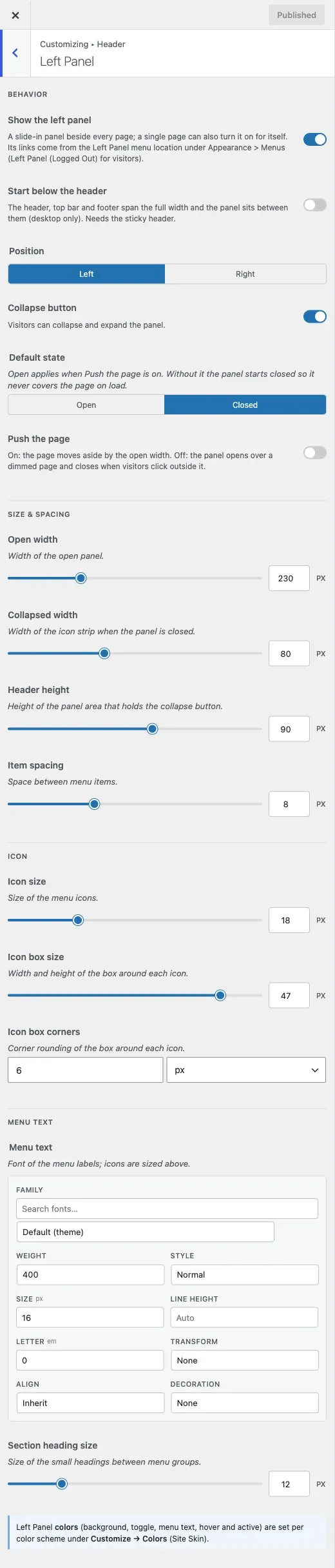
Make sure Show the left panel is on. It is on by default and works across the whole site.
-
Go to Appearance > Menus, pick your menu and open Menu Settings. Tick Left Panel - Logged in users for members. Tick Left Panel - Logged out users for everyone else. Save the menu.
The switch shows nothing until a menu is assigned to one of these two places.
-
Back in the Customizer, set how it behaves:
- Position puts it on the left or the right.
- Collapse button adds a button to shrink and expand the panel. It is on by default.
- Default state sets whether it starts open or closed. The default is closed. Open works only when Push the page is on.
- Push the page moves your content aside when the panel opens. Off by default, the panel opens over a dimmed page instead and closes when someone clicks outside it. Do not use it with the Boxed site layout.
- Start below the header keeps the header, top bar and footer full width. The panel then starts under the header and ends where the footer begins. It is desktop only, needs Sticky On Scroll under Sticky menu, and does not work with the Boxed layout.
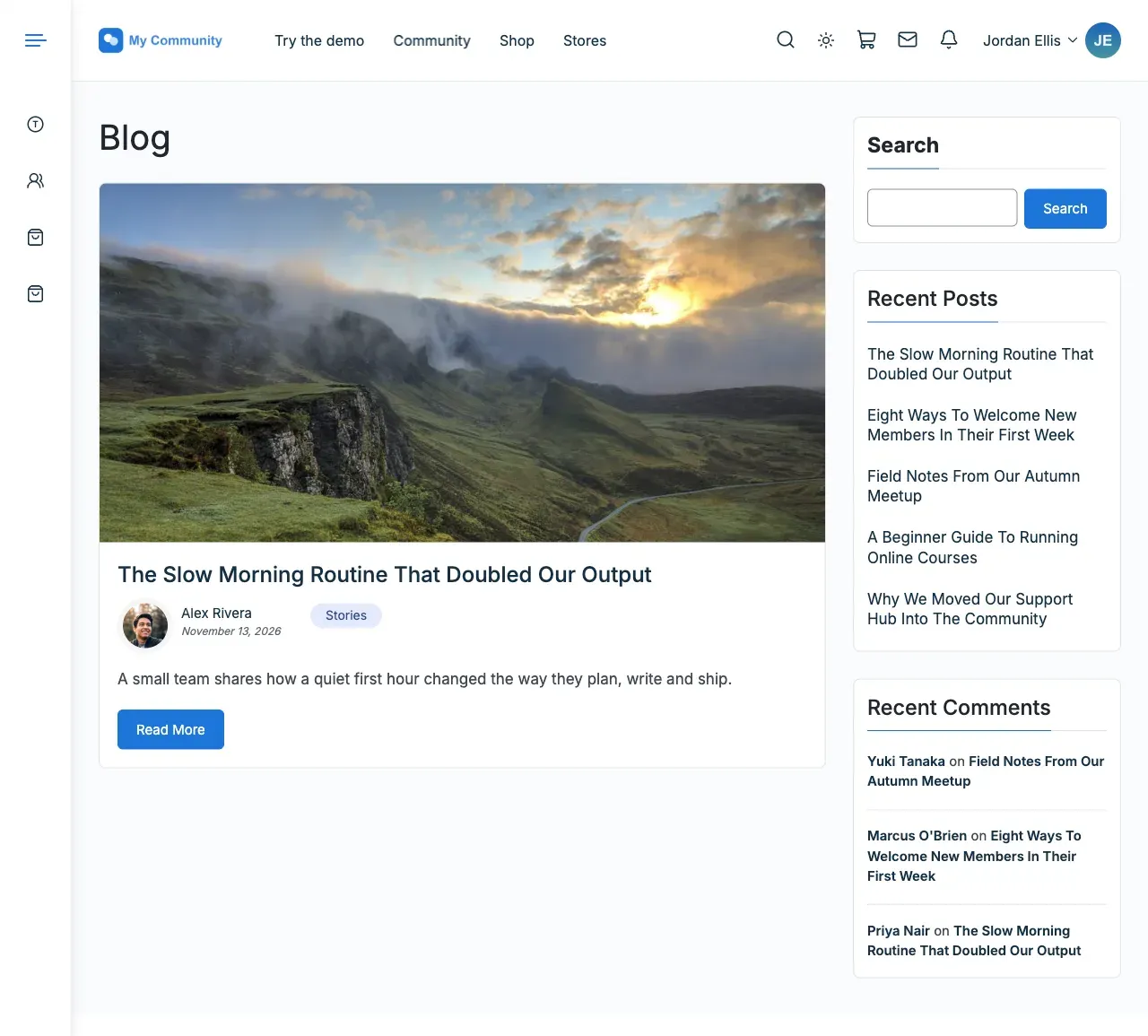
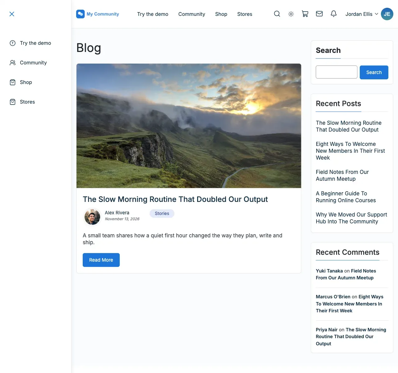
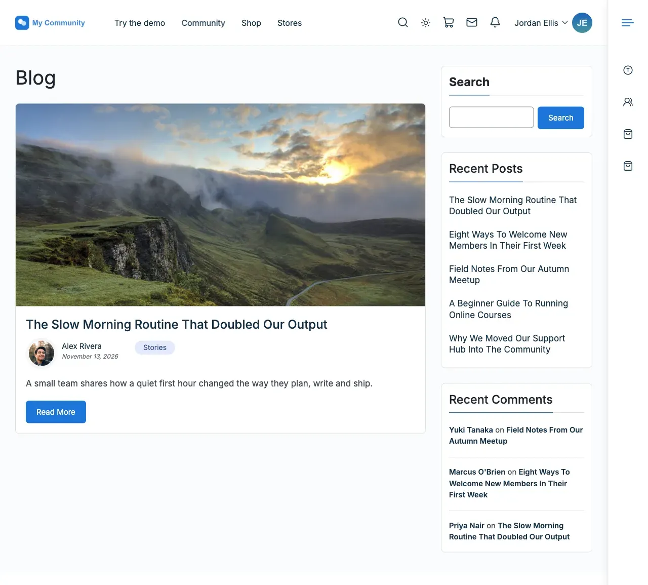
-
Set its size under Size and Spacing:
- Open width: 230px by default, from 180 to 360.
- Collapsed width: 80px by default, from 56 to 120. This is the icon-only strip.
- Header height: 90px by default, from 50 to 120. This is the area that holds the collapse button.
- Item spacing: 8px by default, from 0 to 24. This is the gap between menu items.
-
Style the icons under Icon: Icon size (18px by default), Icon box size (47px, from 30 to 50) and Icon box corners (6px).
-
Under Menu text, set the font of the labels. Section heading size sets the small group headings (12px by default, from 10 to 20).
-
Click Publish.
You’ll know it worked when
Section titled “You’ll know it worked when”On a screen 1024 pixels or wider, a strip of icons appears down the side of every page. Click the collapse button and it opens to show labels, or shrinks back to icons.
Good to know
Section titled “Good to know”How do I put my menu down the side of the site?
Section titled “How do I put my menu down the side of the site?”Follow the steps above. The side menu is the only menu that sits down the side of the page.
How do I make the side menu start below my header?
Section titled “How do I make the side menu start below my header?”Turn on Start below the header. Turn on Sticky On Scroll first, or the option does nothing.
How do I put the side menu on the right?
Section titled “How do I put the side menu on the right?”Set Position to the right side.
How do I make it start closed?
Section titled “How do I make it start closed?”Set Default state to closed. This is the default.
How do I show different links to logged-out visitors?
Section titled “How do I show different links to logged-out visitors?”Assign a different menu to Left Panel - Logged out users.
How do I add headings to group my links?
Section titled “How do I add headings to group my links?”Sections are small headings such as Community, Shop and Help. They work in the side menu and the phone menu, with any community plugin or none.
- Go to Appearance > Menus and choose Screen Options at the top right. Tick Reign Panel Sections. WordPress hides most boxes the first time you open this screen, so the box is missing until you tick it.
- Pick the menu, open Menu Settings and assign it to a Left Panel or Mobile Menu location. Save. Until you do, the box shows a notice and the Add Section button stays hidden.
- In the Reign Panel Sections box, click Add Section, type a label and save the menu.
- Drag the links that belong in the section under it and indent them slightly. Save again.
The label shows above its links. If you cannot see the box, check that the menu you are editing is assigned to a Left Panel or Mobile Menu location.
Why is Reign Panel Sections missing from Appearance > Menus?
Section titled “Why is Reign Panel Sections missing from Appearance > Menus?”Open Screen Options at the top right of that screen and tick Reign Panel Sections.
How do I change the side menu colours?
Section titled “How do I change the side menu colours?”This section has no colour controls. The panel colours come from your colour scheme under Color Options. To make the panel differ from the rest of the site, use Change one specific colour.
Can screen readers and keyboards use it?
Section titled “Can screen readers and keyboards use it?”Yes. The toggle button announces its name and whether it is open or closed. When the panel is collapsed, labels show on keyboard focus.
Can I turn it on for one page only?
Section titled “Can I turn it on for one page only?”Yes. You can also turn the panel on for a single page by editing that page.