You can now make your site more appealing with all new reign color scheme options. From version 2.3.0 onwards, you will get palettes of tonal color options to dig from as per your choices.
You will get the option inside:
Dashboard >> Appearance >> Customize >> colors.
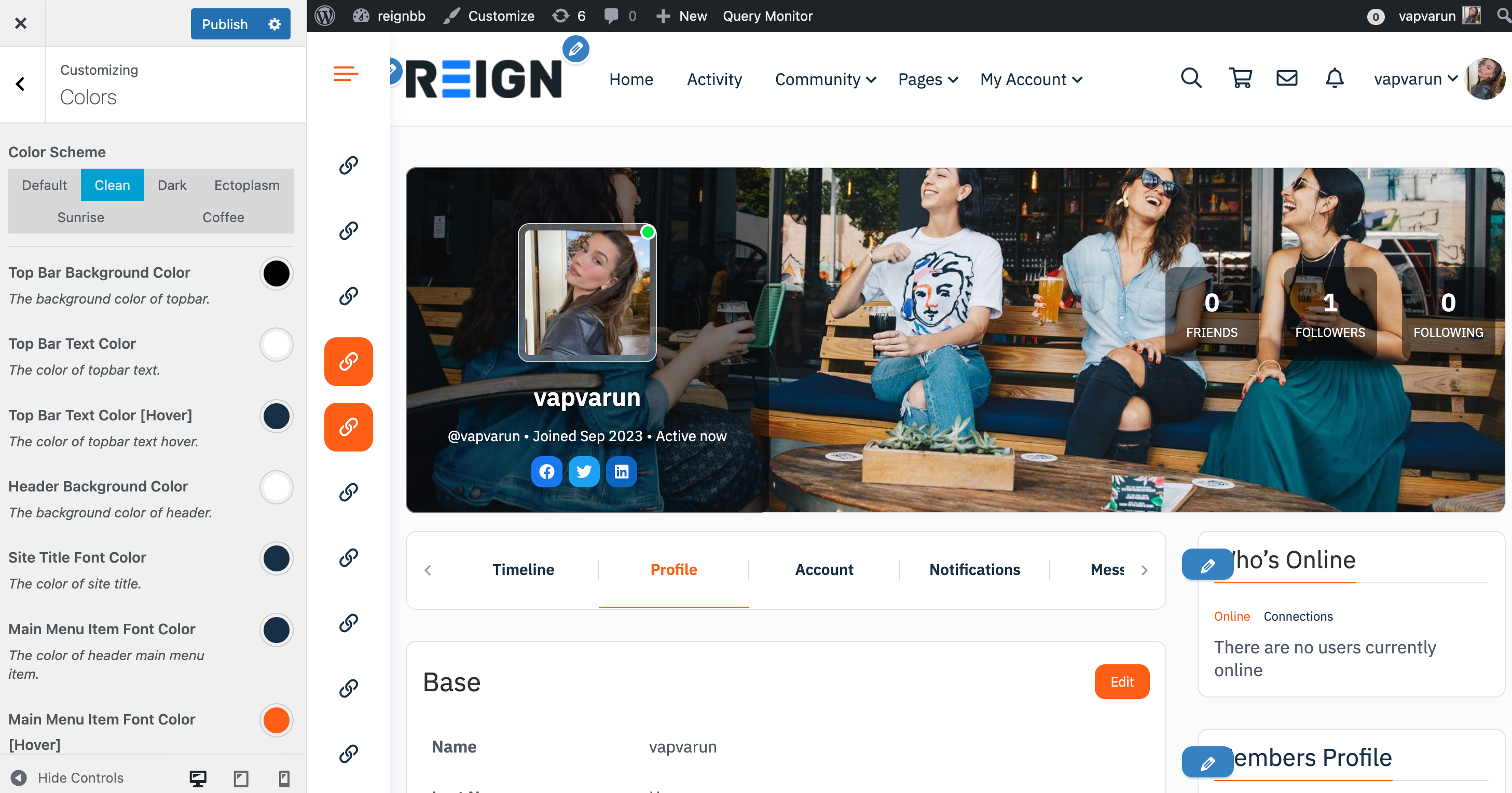
Here, you will get the following options to play around with.
Color Scheme
This allows you to select the color scheme for your site. By default, The following color schemes are available:
- Default
- Clean
- dark
- Ectoplasm
- Sunrise
- Coffee
Based on the selected scheme, You can customize the colors as well.
If you don’t want any of the listed options in the color scheme section, then you can create your own by following options.
Top Bar Colors
Top Bar Background Color
This setting allows you to select or pick the color that will be applied to the top bar. In other words, you have the ability to customize the visual appearance of the top bar by choosing a specific color according to your preferences.
Top Bar Text Color
This setting provides you with the ability to select the color of the text displayed in the top bar. In simpler terms, you can customize the appearance of the text in the top bar by choosing a specific color that aligns with your preferences or the overall design of the interface.
Top Bar Text Color[Hover]
This setting allows you to specify the color of the text in the top bar when a user hovers over it with their cursor. In other words, you can customize the appearance of the text in the top bar to change specifically when someone interacts with it by hovering. This feature enables you to create dynamic and responsive visual effects for the top bar text when users engage with it.
Header Background Color
This setting provides you with the ability to select the color that will be applied to the website header. In simple terms, you can customize the visual appearance of the header by choosing a specific color that aligns with your design preferences or the overall theme of the website.
Site Title Font Color
This option allows you to select the color for the font used in the title of the website. In other words, you have the ability to customize the text color specifically for the website’s title, ensuring it aligns with your design preferences or the overall color scheme of the site.
Top Bar Colors
Main Menu Item Font Color
This setting allows you to select the color for the header’s main menu items. In simpler terms, you can customize the visual appearance of the text or background color of the menu items in the header according to your design preferences or the overall theme of the website or application.
Main Menu Item Font Color
This option allows you to specify the color of the header’s main menu item when a user hovers their cursor over it. In other words, you can customize the appearance of the menu item in the header to change specifically when someone interacts with it by hovering.
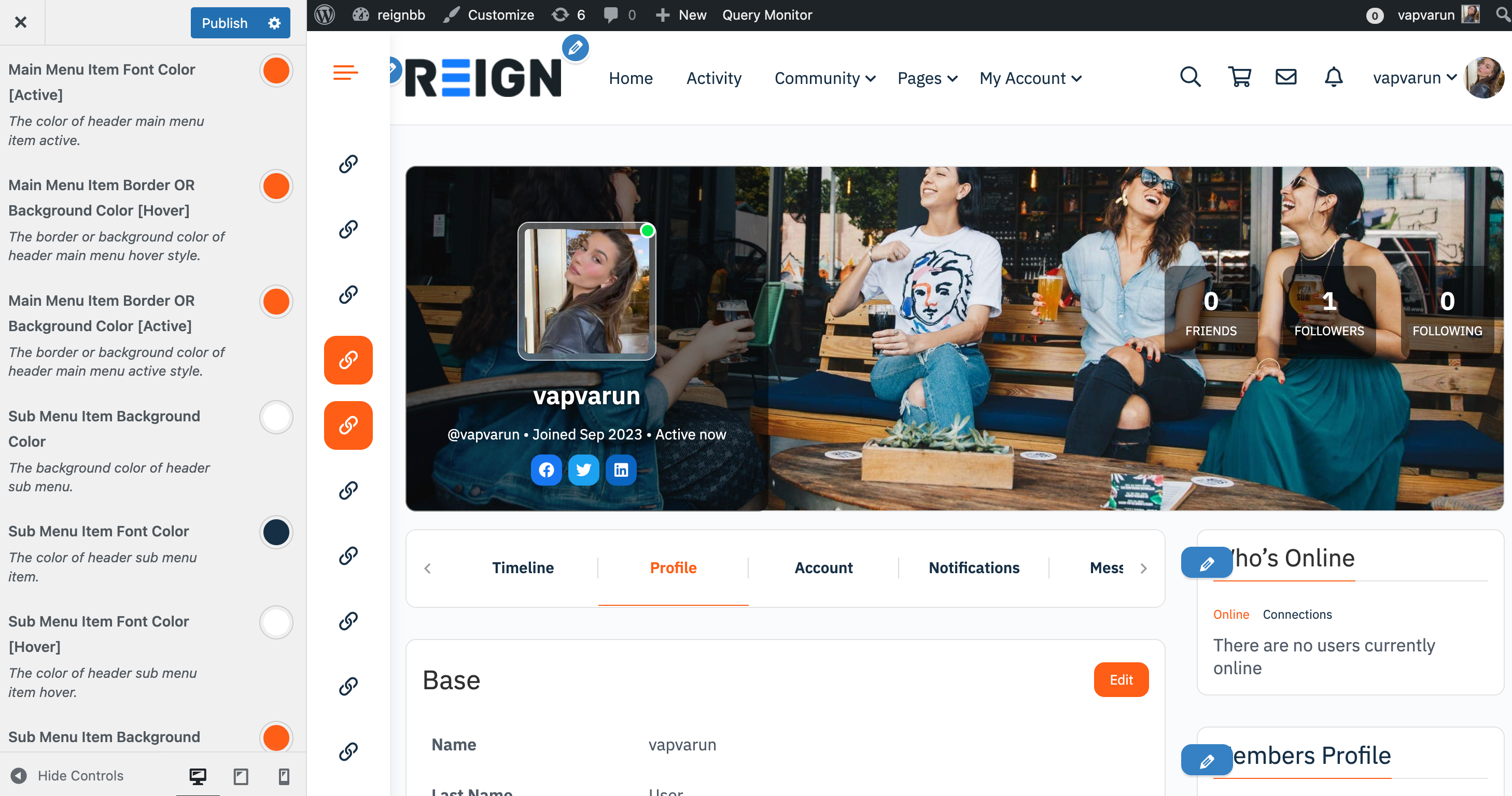
Main menu Item Font Color
This option provides you with the ability to customize the color of the font used for the main menu item when it is in the active state. In practical terms, when a user selects or interacts with a specific menu item, the font color of that item can be modified according to your preferences or the overall design scheme. This customization allows you to visually highlight the active state of a menu item, providing a clear visual indication to users about their current navigation choice.
Main menu Item Border or Background Color [Hover]
This option allows you to customize the appearance of the header’s main menu when a user hovers their cursor over it. Specifically, you can choose to change either the border color or the background color of the main menu items during the hover state. This customization provides a dynamic and responsive visual effect, making the header visually interactive by altering its appearance when users interact with the main menu through hovering.
Main menu Item Border or Background Color [Active]
This feature allows you to customize the border or background color of the header’s main menu item when it is currently in the active state. In other words, you can modify the visual appearance of the header’s main menu item when it is selected or being interacted with.
Sub Menu Colors
Sub menu Item Background Color
This option grants you the ability to modify the visual characteristics of the sub-menu items on your website. You can specifically choose to change either the background color of these sub-menu items. Body Text Color – This allows you to choose a body text color for a site.
Sub menu Item Font Color
This option provides you with the capability to select the color of the text (font) used for sub-menu items on your website. In other words, you can customize the appearance of the text in the sub-menu items by choosing a specific font color.
Sub menu Item Font Color [Hover]
This option allows you to specify the color of the text (font) used for sub-menu items when a user hovers their cursor over them.
Sub Menu Item Background Color [Hover]
It allows you to customize the appearance of the background of a sub-menu item during the hover state, providing a dynamic and responsive visual effect.
Header Colors
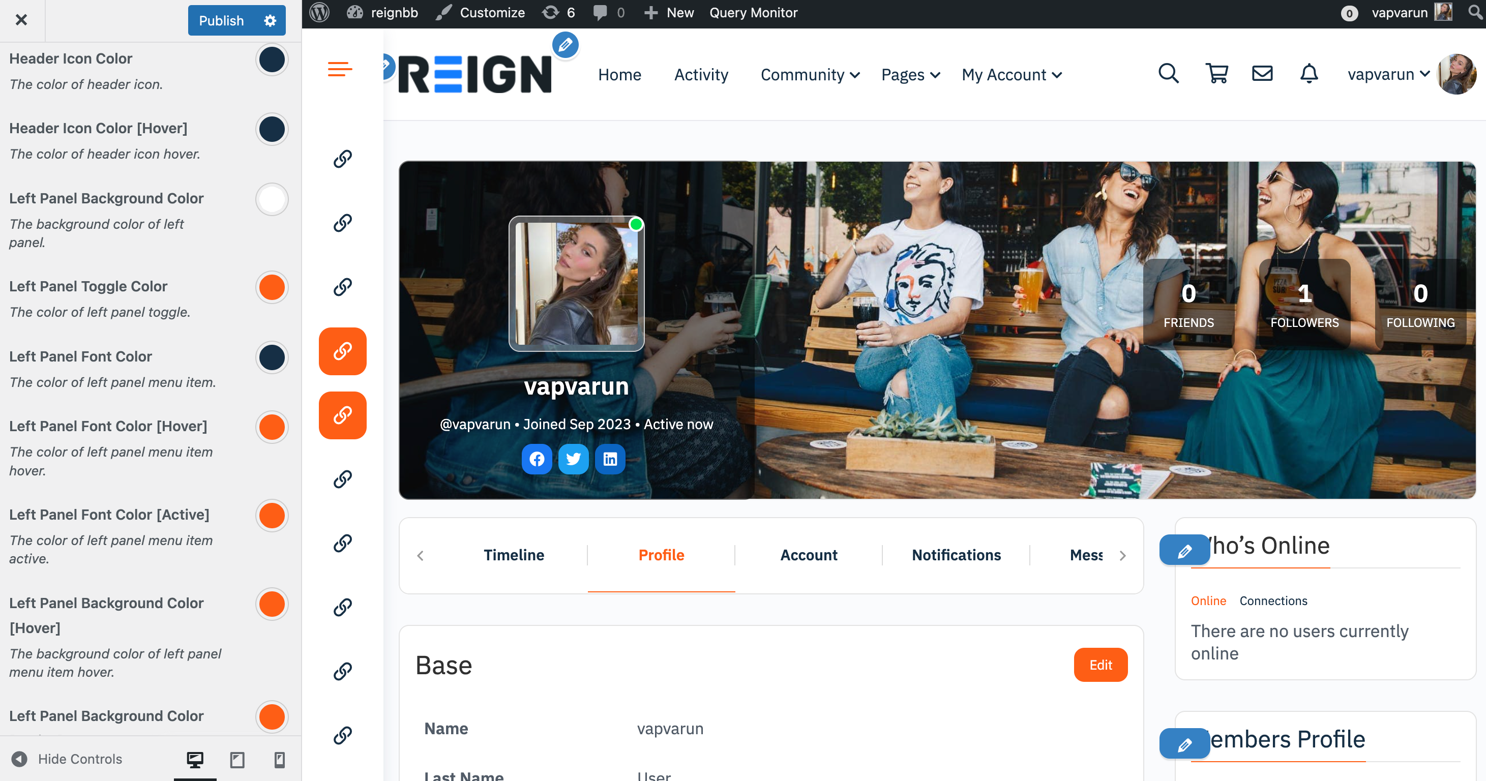
Header Icon Color
This option grants you the ability to determine the color of the icon in the header. In other terms, if your website or application employs icons in the header section, this setting allows you to customize their color. By choosing a specific icon color, you can align the visual appearance of the icons with your design preferences or maintain consistency with the overall color scheme of your website or application.
Header icon Color[Hover]
This option allows you to define the color of the icon in the header when a user hovers their cursor over it. In practical terms, when someone interacts with the header by hovering, the icon’s color can be changed according to your preferences. This customization provides a dynamic and responsive visual effect, making the icon visually distinctive or responsive during user engagement. It’s a way to enhance the user experience by providing visual feedback when interacting with elements in the header.
Left panel Background Color
This option allows you to select the color that will be used as the background of the left panel.
Left Panel Toggle Color
This option lets you choose the color of the toggle control in the left panel. The toggle control is used to expand or collapse the left panel, revealing or hiding its contents.
Left Panel Font Color
This option enables you to set the color of the text (font) used in the left panel. This includes the text associated with navigation links or any other textual content within the panel.
Left Panel Font Color [Hover]
Here, you can choose a specific color for the font when a user hovers their cursor over the text in the left panel. This customization provides a visual indication of interactivity.
Left Panel Font Color[Active]
This option allows you to set the font color for text in the left panel when it is in an active state. An active state typically means that a particular element or section in the left panel is currently selected or being used.
Left Panel Background Color [Hover]
Similar to font color on hover, this option lets you choose the background color of the left panel when a user hovers over it. This provides a visual cue that the left panel is interactive.
Left Panel Background Color [Active]
This option allows you to set the background color of the left panel when it is in an active state. This helps highlight the selected or active section of the left panel.
Left Panel Icon Color [Hover/Active]
Left Panel Tooltip Background Color
This option allows you to select the color that will be used as the background of tooltips in the left panel.
Left Panel Tooltip Color
This option lets you choose the color of the text and other content within the tooltips in the left panel.

Body Background Color
This option lets you choose the Background color of the website body.
Body text Color
This option lets you choose the text color of the website body.
Sections Background Color
This option lets you choose the Background color of the sections available on the website.
Secondary Background Color
This option lets you choose the Background color of the secondry elements.
Theme Color
Headings Color
This option lets you choose all the heading colors of the website.
Link Color
This option lets you customize colors of all the links of your website.
Link Color[Hover]
This option lets you customize colors of all the links of your website on hover.
Content Link Color
This option lets you customize colors of content area for all the links of your website.
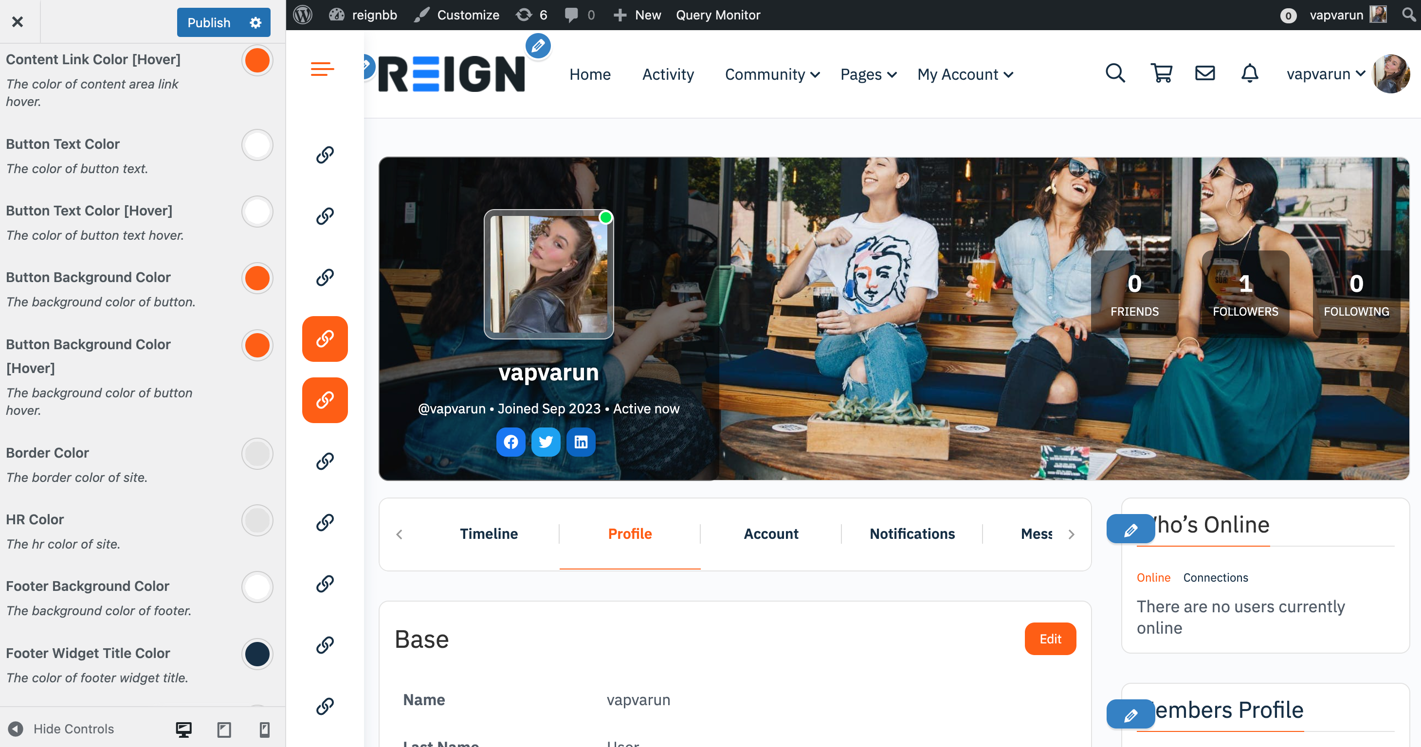
Content Link Color[Hover]
This option lets you customize colors of content area for all the links of your website on hover state.
Button Text Color
Button Text Color[Hover]
Button Bacground Color
Border Color