

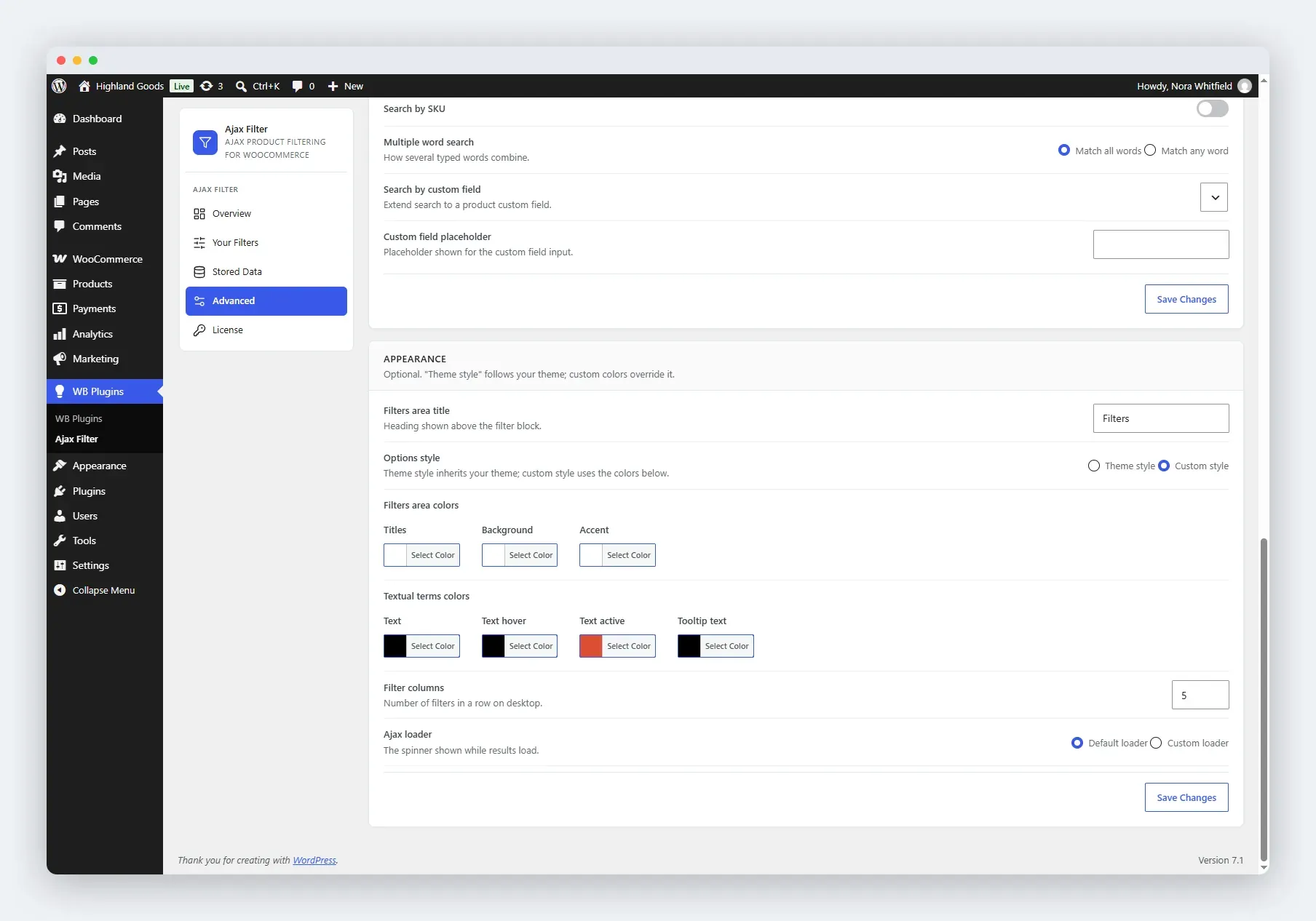
Customise how the filter block looks. Configure it on the Advanced tab (WB Plugins → Ajax Filter → Advanced) in the Appearance card.
Filters Area Title
Section titled “Filters Area Title”A heading shown above the filter block (default: “Filters”). Leave it empty to hide it.
Options Style
Section titled “Options Style”- Theme style (default) - the filter inherits your theme’s colours and fonts automatically through CSS custom properties. Works out of the box with BuddyX, Reign, and any theme that exposes standard WordPress palette colours.
- Custom style - uses the colours you pick below and overrides the theme.
Filters Area Colours
Section titled “Filters Area Colours”These apply when “Custom style” is selected:
| Control | Used For |
|---|---|
| Titles | Filter headings (default: black) |
| Background | The filter panel background (default: white) |
| Accent | Active states, links, the price-slider fill (default: blue) |
Textual Terms Colours
Section titled “Textual Terms Colours”Colours for text-based filter terms (category and attribute names):
| Control | Used For |
|---|---|
| Text | Default term text (default: black) |
| Text hover | Term text on hover (default: black) |
| Text active | Term text when selected (default: orange) |
| Tooltip text | Text inside tooltips (default: black) |
Layout
Section titled “Layout”- Filter columns - how many filters sit in a row on desktop, from 2 to 5 (default: 5). On mobile, filters always stack into a single column.
Ajax Loader
Section titled “Ajax Loader”The spinner shown while results load:
- Default loader - the plugin’s built-in spinner.
- Custom loader - upload a GIF to use as the loading indicator. GIF only. “Reset to default” clears it and restores the built-in spinner.
Saving Changes
Section titled “Saving Changes”Click Save Changes at the bottom of the card. Colour changes appear immediately on the frontend.
Related
Section titled “Related”- Filtering Behaviour - how filters apply.
- Product Search - the search field with autocomplete.