

Analytics
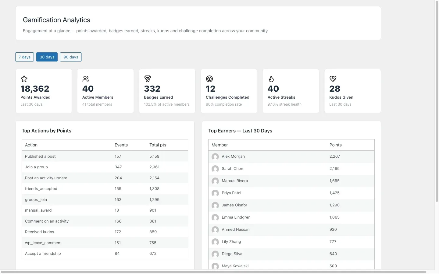
The Analytics dashboard gives you a high-level view of how your community’s gamification program is performing. All data is aggregated and read-only — you cannot modify any records from this screen.
Accessing the Dashboard
Section titled “Accessing the Dashboard”Go to Gamification > Analytics in your WordPress admin.
Period Selector
Section titled “Period Selector”At the top of the dashboard, a period selector lets you choose between three reporting windows:
| Period | What It Shows |
|---|---|
| 7 days | Activity from the past week |
| 30 days | Activity from the past month (default) |
| 90 days | Activity from the past quarter |
Changing the period reloads all KPI cards and tables for that window.
KPI Cards
Section titled “KPI Cards”Six summary cards appear at the top of the page:
Points Awarded — Total points given to all members during the selected period. A rising trend indicates increasing member participation.
Active Members — Number of distinct members who earned at least one point during the period. Compare this against your total member count to see your engagement rate.
Badges Earned — Total badge awards during the period. A drop in this number can indicate members have collected the easy badges and you may need new milestone badges.
Badge Earn Rate — Percentage of active members who also earned a badge during the period. Useful for understanding whether your badge thresholds are achievable.
Challenge Completion Rate — Percentage of members who started a challenge and completed it. Low completion rates may indicate challenge targets are too high or time windows too short.
Streak Health — Percentage of members with a current streak greater than 0. This measures day-over-day retention — members maintaining a streak are likely to return tomorrow.
Top Actions Table
Section titled “Top Actions Table”Below the KPI cards, a table shows the top point-earning actions ranked by total points awarded during the period. Columns:
- Action name
- Number of times the action was performed
- Total points awarded from this action
- Number of distinct members who performed it
Use this table to understand which behaviors your members are taking most often. If a high-value action (like completing a course) rarely appears, consider whether it is promoted enough or whether the points value is motivating.
Top Earners Table
Section titled “Top Earners Table”A table of the top point-earners for the period with their avatar, name, total points in the period, and rank.
This is distinct from the public leaderboard — it shows only the selected period and is only visible to admins.
Daily Points Sparkline
Section titled “Daily Points Sparkline”A small line chart shows total points awarded each day across the selected period. Use it to spot days with unusually high or low activity, and correlate with events like challenge launches or content publishing.
Data Freshness
Section titled “Data Freshness”All analytics queries are cached for 10 minutes. The dashboard notes the last-refreshed time at the bottom of the page. If you need up-to-the-minute data after a major manual award, wait 10 minutes or clear the object cache.
What Is Not Shown
Section titled “What Is Not Shown”The analytics dashboard shows aggregate data only. It does not show:
- Individual member point transactions (see Gamification > Members for that)
- Historical data beyond 90 days via the period selector (though all data remains in the database)
- Real-time live updates — the page must be reloaded to see fresh data