

Phone and tablet layouts (Responsive design)
Also called: mobile layout, mobile view, hide on mobile, tablet view, columns on phone, breakpoints, device visibility.
What this does
Section titled “What this does”Wbcom Essential blocks and widgets let you set layout and visibility for desktop, tablet and mobile. Blocks and Elementor widgets do this in different ways.
Breakpoints in blocks
Section titled “Breakpoints in blocks”The blocks use these breakpoints:
| Device | Screen width |
|---|---|
| Desktop | Wider than 1024px |
| Tablet | 768px to 1024px |
| Mobile | 767px and narrower |
In the block editor, switch device with the preview buttons in the toolbar. Responsive settings then apply to the device you are previewing.
Responsive settings in blocks
Section titled “Responsive settings in blocks”| Setting | Where it appears |
|---|---|
| Device Visibility | All 35 blocks. |
| Padding and margin per device | Blocks with a spacing control, such as Hero, Promo Banner, Timeline, Category Grid, Groups Grid and Activity Feed. |
| Columns per device | The grid blocks: Category Grid, Groups Grid, Members Grid, Portfolio Grid and Product Grid. |
Phone layouts
Section titled “Phone layouts”On phones the blocks are laid out to read well without any setting:
- Members Grid starts at two columns (Columns (Mobile) is 2).
- Groups Grid keeps each group as a row, with the photo on the left and the details on the right.
- Countdown Timer keeps its boxes on one row.
- Carousel dots are larger, so they are easy to tap.
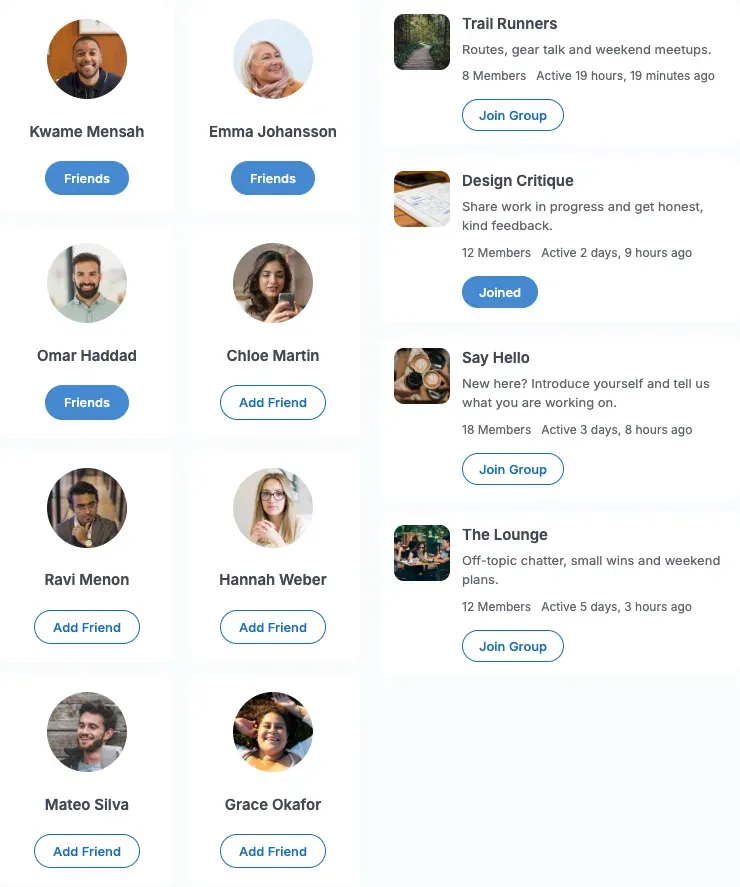
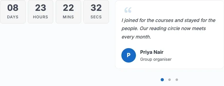
You can still change the columns per device in the block settings.
How do I hide a block on some devices?
Section titled “How do I hide a block on some devices?”- Select the block.
- Open the block settings and find Device Visibility.
- Turn on Hide on Desktop, Hide on Tablet or Hide on Mobile.
The block stays in the editor. It is hidden on the front end for that device range only.
Responsive settings in Elementor widgets
Section titled “Responsive settings in Elementor widgets”Elementor widgets use Elementor’s own device icons. Click the device icon next to a setting, then set a value for that device. Elementor controls the breakpoint widths.
Some widgets add their own device options:
- Post Carousel can hide its arrows, dots, categories, excerpt and card footer on desktop, tablet or mobile.
- Post Slider and Slider can hide their dots and arrows on desktop, tablet or mobile.
- Site Logo and Smart Menu have a Mobile Breakpoint setting.
- Product Tab, Universal Product and WooCommerce Testimonial set how many slider items show on tablet and on mobile phones.
Reduced motion
Section titled “Reduced motion”If a visitor’s device asks for reduced motion, the blocks cut animations and transitions to almost nothing. This applies to every Wbcom Essential block.
Check your layout
Section titled “Check your layout”- Preview the page on desktop, tablet and mobile in the editor.
- Open the live page and resize the browser window.
- Test on a real phone.
You’ll know it worked when
Section titled “You’ll know it worked when”The layout changes at each width. A block you hid on mobile is gone on the phone but still in the editor.