

WooCommerce Blocks (Product slider, product grid, reviews)
Also called: product slider, product carousel, product grid, shop grid, featured products, best sellers, store reviews, customer reviews slider.
This page covers three blocks that show your shop: Customer Reviews (a review slider), Product Carousel (a product slider) and Product Grid. They appear in the block inserter under Essential - WooCommerce. They need WooCommerce.
If WooCommerce is not active, these blocks show a notice that says “WooCommerce plugin is required for this block”.
Every block here also has the Spacing and Advanced settings described in Blocks Overview.
Customer Reviews
Section titled “Customer Reviews”WooCommerce product reviews in a Swiper carousel, with the reviewer’s avatar, star rating, name and a link to the product.
What it is for: Use it to show store reviews in a slider as proof that people buy from you.
Add it
Section titled “Add it”- Open the block inserter.
- Search for Customer Reviews.
- Select it to insert it into the page.
Settings
Section titled “Settings”| Panel | Setting | What it does | Default |
|---|---|---|---|
| Query Settings | Number of Reviews | How many reviews to load. | 6 |
| Carousel Settings | Slides Per View (Desktop) | Reviews visible on desktop. | 2 |
| Carousel Settings | Autoplay | Moves slides automatically. | On |
| Carousel Settings | Autoplay Delay (ms) | Time between slides. | 4000 |
| Carousel Settings | Loop | Returns to the first slide after the last. | On |
| Carousel Settings | Show Navigation Dots | Shows the dots. | On |
| Carousel Settings | Show Navigation Arrows | Shows the arrows. | On |
| Review Card Settings | Show Avatar | Shows the reviewer avatar. | On |
| Review Card Settings | Show Star Rating | Shows the star rating. | On |
| Review Card Settings | Show Product Name | Shows the reviewed product with a link. | On |
| Style | Card Background | Card background. | Theme surface |
| Style | Quote Text Color | Color of the review text. | Theme text |
| Style | Reviewer Name Color | Color of the reviewer name. | Theme text |
| Style | Star Rating Color | Color of the filled stars. | #f5a623 |
| Style | Border Radius, Box Shadow | Rounds the card corners and adds a shadow. | Shadow off |

- The block says “No reviews found” if your store has no reviews yet.
- The arrows sit beside the cards, not over the review text.
- On right-to-left sites the previous arrow is on the right and the next arrow on the left.
- Cards in the same row share one height. A short review never sits next to a taller card.
- Colors left empty follow your theme in light and dark mode. Pick a color to override it.
Product Carousel
Section titled “Product Carousel”WooCommerce products in a Swiper carousel with autoplay, arrows, dots and a number of slides that adapts to the screen.
What it is for: Use it to show products in a slider, such as new arrivals or best sellers.
Add it
Section titled “Add it”- Open the block inserter.
- Search for Product Carousel.
- Select it to insert it into the page.
Settings
Section titled “Settings”| Panel | Setting | What it does | Default |
|---|---|---|---|
| Query Settings | Products Per Page | How many products to load. | 8 |
| Query Settings | Order By | Date, Title, Price, Popularity, Rating or Random. | Date |
| Query Settings | Order | Descending or Ascending. | Descending |
| Carousel Settings | Slides Per View (Desktop) | Products visible on desktop. | 4 |
| Carousel Settings | Slides Per View (Tablet) | Products visible on tablets. | 2 |
| Carousel Settings | Slides Per View (Mobile) | Products visible on phones. | 1 |
| Carousel Settings | Space Between Slides (px) | Space between cards. | 24 |
| Carousel Settings | Autoplay | Moves slides automatically. | On |
| Carousel Settings | Autoplay Delay (ms) | Time between slides. | 3000 |
| Carousel Settings | Loop | Returns to the first slide after the last. | On |
| Carousel Settings | Show Navigation Dots | Shows the dots. | On |
| Carousel Settings | Show Navigation Arrows | Shows the arrows. | On |
| Card Settings | Show Product Image | Shows the product image. | On |
| Card Settings | Show Price | Shows the price. | On |
| Card Settings | Show Star Rating | Shows the average rating. | On |
| Card Settings | Show Add to Cart | Shows the add-to-cart button. | On |
| Style | Card Background | Card background. | Theme surface |
| Style | Title Color | Color of the product title. | Theme text |
| Style | Price Color | Color of the price. | Theme accent |
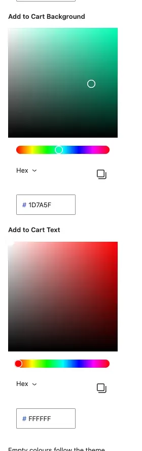
| Style | Add to Cart Background | Background of the add-to-cart button. | Theme button color |
| Style | Add to Cart Text | Text of the add-to-cart button. | Theme button text color |
| Style | Border Radius, Box Shadow | Rounds the card corners and adds a shadow. | Shadow off |
- The block says “No products found” if no product matches.
- Hidden products are left out. That means products with catalog visibility set to Hidden or Search results only.
- Sold-out products are left out when WooCommerce is set to hide them. Check WooCommerce > Settings > Products > Inventory > Out of stock visibility.
- The block shows what your shop pages show.
- Colors left empty follow your theme in light and dark mode. Pick a color to override it.
Product Grid
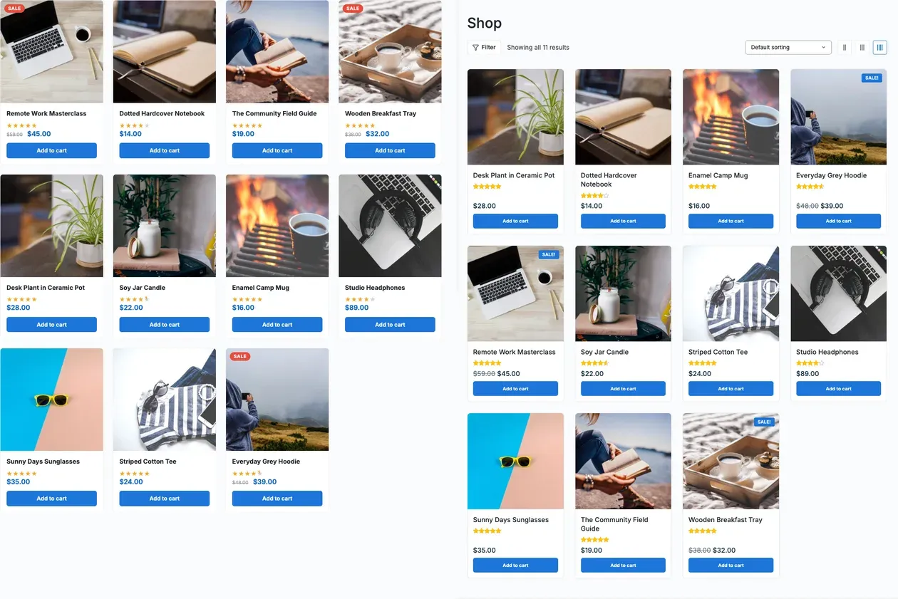
Section titled “Product Grid”WooCommerce products in a responsive grid with a sale badge, star rating and add-to-cart button.
What it is for: Use it to list products in a grid on any page, outside your main shop page.
Add it
Section titled “Add it”- Open the block inserter.
- Search for Product Grid.
- Select it to insert it into the page.
Settings
Section titled “Settings”| Panel | Setting | What it does | Default |
|---|---|---|---|
| Query Settings | Products Per Page | How many products to show. | 8 |
| Query Settings | Order By | Date, Title, Price, Popularity, Rating, Random or Menu Order. | Date |
| Query Settings | Order | Descending or Ascending. | Descending |
| Layout | Columns (Desktop) | Columns on desktop. | 4 |
| Layout | Columns (Tablet) | Columns on tablets. | 2 |
| Layout | Columns (Mobile) | Columns on phones. | 1 |
| Layout | Gap (px) | Space between cards. | 24 |
| Layout | Image Ratio | 1:1 (Square), 4:3, 3:4 (Portrait) or 16:9. | 1:1 |
| Card Settings | Show Product Image | Shows the product image. | On |
| Card Settings | Show Price | Shows the price. | On |
| Card Settings | Show Star Rating | Shows the average rating. | On |
| Card Settings | Show Add to Cart | Shows the add-to-cart button. | On |
| Card Settings | Show Sale Badge | Shows a badge on products on sale. | On |
| Style | Card Background | Card background. | Theme surface |
| Style | Title Color | Color of the product title. | Theme text |
| Style | Price Color | Color of the price. | Theme accent |
| Style | Add to Cart Background | Background of the add-to-cart button. | Theme button color |
| Style | Add to Cart Text | Text of the add-to-cart button. | Theme button text color |
| Style | Sale Badge Color | Color of the sale badge. | #e74c3c |
| Style | Border Radius, Box Shadow | Rounds the card corners and adds a shadow. | Shadow off |
- The block says “No products found” if no product matches.
- Hidden products are left out. That means products with catalog visibility set to Hidden or Search results only.
- Sold-out products are left out when WooCommerce is set to hide them. Check WooCommerce > Settings > Products > Inventory > Out of stock visibility.
- The block shows what your shop pages show.
- Colors left empty follow your theme in light and dark mode. Pick a color to override it.
You’ll know it worked when
Section titled “You’ll know it worked when”View the page while WooCommerce is active. You see your real products or reviews with prices and buttons.
Good to know
Section titled “Good to know”Why is a product missing from the block?
Section titled “Why is a product missing from the block?”Hidden products are left out. So are sold-out products if WooCommerce hides them. The block follows your shop page.
Can I match my theme colours?
Section titled “Can I match my theme colours?”Yes. Leave a colour empty and it follows your theme, in light and dark mode.
For developers
Section titled “For developers”Each block has an internal name, used in block markup and code.
| Block | Internal name |
|---|---|
| Customer Reviews | wbcom-essential/customer-reviews |
| Product Carousel | wbcom-essential/product-carousel |
| Product Grid | wbcom-essential/product-grid |