

Content Blocks (FAQ, login form, portfolio, tabs, timeline)
Also called: FAQ accordion, questions and answers, login box, sign in form, project grid, filterable gallery, tabbed content, history timeline.
This page covers five blocks that organise information. They are FAQ Accordion (questions and answers), Login Form (a log in box), Portfolio Grid (a filterable project grid), Tabs and Timeline. They appear in the block inserter under Essential - Content and need no other plugin.
Every block here also has the Spacing and Advanced settings described in Blocks Overview.
FAQ Accordion
Section titled “FAQ Accordion”Collapsible questions and answers. It can also output FAQPage structured data so search engines can read your FAQ.
What it is for: Use it to answer common questions in a tidy list that opens and closes.
Add it
Section titled “Add it”- Open the block inserter.
- Search for FAQ Accordion.
- Select it to insert it into the page.
Settings
Section titled “Settings”| Panel | Setting | What it does | Default |
|---|---|---|---|
| FAQ Items | Item list | Select an item to edit it, or remove it. | Sample items |
| Edit Selected FAQ | Question | The question text. | Per item |
| Edit Selected FAQ | Answer | The answer text. | Per item |
| Layout | Icon Style | Chevron, Plus or Arrow icon on each question. | Chevron |
| Layout | Allow Multiple Open | Lets more than one item stay open at once. | Off |
| Layout | Open First Item | Opens the first FAQ when the page loads. | On |
| Layout | Enable FAQ Schema (JSON-LD) | Outputs FAQPage structured data for SEO. | On |
| Style | Question Color | Color of the question text. | Theme text |
| Style | Question Background | Background of each question row. | Theme surface |
| Style | Answer Color | Color of the answer text. | Theme muted text |
| Style | Border Color | Color of the item borders. | Theme border |
| Style | Icon Color | Color of the icon. | #667eea |
| Style | Border Radius, Box Shadow | Rounds the block corners and adds a shadow. | Shadow off |
Login Form
Section titled “Login Form”A WordPress login form with your own button text, colors and redirect.
What it is for: Use it to put a log in box on any page or in a sidebar.
Add it
Section titled “Add it”- Open the block inserter.
- Search for Login Form.
- Select it to insert it into the page.
Settings
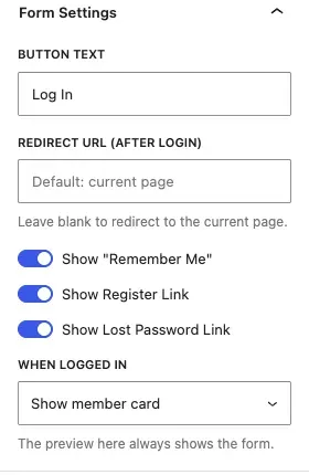
Section titled “Settings”| Panel | Setting | What it does | Default |
|---|---|---|---|
| Form Settings | Button Text | Label of the login button. | Log In |
| Form Settings | Redirect URL (after login) | Where visitors go after logging in. Leave blank to return to the current page. | Blank |
| Form Settings | Show “Remember Me” | Shows the remember-me checkbox. | On |
| Form Settings | Show Register Link | Shows a link to the registration page. | On |
| Form Settings | Show Lost Password Link | Shows a link to the password reset page. | On |
| Form Settings | When logged in | What a logged-in member sees: nothing, a message, or a member card (photo, name, profile and log out links). The editor preview always shows the form. | Show nothing |
| Form Settings | Logged-In Message | Text shown when “When logged in” is set to Show a message. | You are already logged in. |
| Style | Form Background | Background of the form. | Transparent |
| Style | Label Color | Color of the field labels. | Theme text color |
| Style | Button Background | Background of the login button. | Theme button color |
| Style | Button Text Color | Text color of the login button. | Theme button text color |
| Style | Link Color | Color of the register and lost-password links. | Theme link color |
| Style | Border Radius, Box Shadow | Rounds the form corners and adds a shadow. | Shadow off |

- Colors left empty follow your theme, in light and dark mode (Reign, BuddyX and BuddyX Pro). Clear a color to go back to the theme color.
- For a sidebar login box, keep “When logged in” on Show nothing: members see the next widget instead.
- Padding defaults to 0. Add padding when you give the form a background.
- The register link appears only when your site allows new users to register (Settings > General > Membership).
Portfolio Grid
Section titled “Portfolio Grid”A grid of posts or custom post types with a category filter bar, hover effects and responsive columns.
What it is for: Use it to show your work or any posts in a grid that visitors filter by category.
Add it
Section titled “Add it”- Open the block inserter.
- Search for Portfolio Grid.
- Select it to insert it into the page.
Settings
Section titled “Settings”| Panel | Setting | What it does | Default |
|---|---|---|---|
| Query Settings | Post Type | The post type to list. | Post |
| Query Settings | Posts Per Page | How many items to show. | 9 |
| Layout | Columns (Desktop) | Columns on desktop. | 3 |
| Layout | Columns (Tablet) | Columns on tablets. | 2 |
| Layout | Columns (Mobile) | Columns on phones. | 1 |
| Layout | Gap (px) | Space between cards. | 16 |
| Layout | Image Ratio | 1:1 (Square), 4:3, 3:2, 16:9 or 3:4 (Portrait). | 1:1 |
| Card Settings | Show Filter Bar | Shows category tabs above the grid. | On |
| Card Settings | Show Category Badge | Shows the category on each card. | On |
| Card Settings | Show Excerpt | Shows the excerpt on each card. | Off |
| Card Settings | Hover Effect | Overlay, Zoom or Slide Up. | Overlay |
| Card Settings | Card Border Radius (px) | Roundness of each card. | 8 |
| Style | Overlay Color | Color of the hover overlay. | rgba(102, 126, 234, 0.85) |
| Style | Title Color (on hover) | Title color over the overlay. | #ffffff |
| Style | Filter Active Color | Color of the selected filter tab. | #667eea |
| Style | Box Shadow, Border Radius | Adds a shadow and rounds the block corners. | Shadow off |
- The filter bar is built from the categories of the items shown.
- The block says “No portfolio items found” if no items match.
Click-to-switch content panels with an underline or boxed style. The tab list works with a keyboard and screen readers.
What it is for: Use it to fit several short sections into one space, with one tab open at a time.
Add it
Section titled “Add it”- Open the block inserter.
- Search for Tabs.
- Select it to insert it into the page.
Settings
Section titled “Settings”| Panel | Setting | What it does | Default |
|---|---|---|---|
| Tab Items | Tab list | Select a tab to edit it, or remove it. | Sample tabs |
| Edit Selected Tab | Tab Title | Label on the tab. | Per tab |
| Edit Selected Tab | Tab Content | Content shown when the tab is active. | Per tab |
| Layout | Tab Style | Underline or Boxed. | Underline |
| Layout | Tab Alignment | Left, Center or Right. | Left |
| Style | Active Tab Color | Color of the selected tab. | #667eea |
| Style | Inactive Tab Color | Color of the other tabs. | #6c757d |
| Style | Content Background | Background of the content area. | #ffffff |
| Style | Border Color | Color of the borders. | #e9ecef |
| Style | Border Radius, Box Shadow | Rounds the block corners and adds a shadow. | Shadow off |
Timeline
Section titled “Timeline”A vertical timeline with icon dots, date labels and cards.
What it is for: Use it to show a history or a list of steps in date order.
Add it
Section titled “Add it”- Open the block inserter.
- Search for Timeline.
- Select it to insert it into the page.
Settings
Section titled “Settings”| Panel | Setting | What it does | Default |
|---|---|---|---|
| Timeline Items | Item list | Select an item to edit it, or remove it. | Sample items |
| Edit Selected Item | Date / Year | Label shown with the item. | Per item |
| Edit Selected Item | Icon / Emoji | Character shown in the dot. | Per item |
| Edit Selected Item | Title | Item heading. | Per item |
| Edit Selected Item | Description | Item text. | Per item |
| Layout | Timeline Layout | Alternating (left and right), Left (all on right of line) or Right (all on left of line). | Alternating |
| Layout | Dot Size (px) | Size of each dot. | 40 |
| Style | Line Color | Color of the vertical line. | #e9ecef |
| Style | Dot Color | Color of the dots. | #667eea |
| Style | Card Background | Background of each card. | #ffffff |
| Style | Date Color | Color of the date label. | #667eea |
| Style | Title Color | Color of the item title. | #1e1e2e |
| Style | Description Color | Color of the item text. | #6c757d |
| Style | Border Radius, Box Shadow | Rounds the block corners and adds a shadow. | Shadow off |
You’ll know it worked when
Section titled “You’ll know it worked when”View the page. Questions open and close, tabs switch when clicked, the portfolio filter hides other categories, and the login form shows your button text.
Good to know
Section titled “Good to know”Does the FAQ help with Google search?
Section titled “Does the FAQ help with Google search?”Yes. Enable FAQ Schema (JSON-LD) is on by default and tells search engines about your questions.
What does a logged-in member see in the Login Form?
Section titled “What does a logged-in member see in the Login Form?”Whatever you choose in When logged in: nothing, a message or a member card.
For developers
Section titled “For developers”Each block has an internal name, used in block markup and code.
| Block | Internal name |
|---|---|
| FAQ Accordion | wbcom-essential/faq-accordion |
| Login Form | wbcom-essential/login-form |
| Portfolio Grid | wbcom-essential/portfolio-grid |
| Tabs | wbcom-essential/tabs |
| Timeline | wbcom-essential/timeline |